Difference between revisions of "What Makes A Good Submission/The Spriters Resource"
(→The Sheet Icon) |
|||
| Line 66: | Line 66: | ||
==The Sheet Icon== | ==The Sheet Icon== | ||
| + | Icons for sprite sheets are 145px x 125px images. Unless the image fills up the entire icon, it should have a transparent background. The website itself creates the border and background for the icon. | ||
| + | |||
| + | [[File:Sheet-icon-example.png|center]] | ||
| + | |||
| + | Sheet icons must be in .PNG or .GIF format. The icon should give a quick idea of the content of the sheet, and not contain any sprites not present in the sheet. | ||
| + | |||
| + | Some sprites in the icon may be scaled up by 200% if they are too small for reasonable viewing. In this case NO SCALING FILTER should be applied, to preserve the sharpness and prevent making it blurry. | ||
| + | |||
| + | [[File:2x-example.png|center]] | ||
| + | |||
| + | ''To see our old sheet icons, check out our [[History]] page.'' | ||
Revision as of 06:13, 1 August 2014

Contents
[hide]The Sheet
Background Color
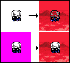
A simple mistake that a lot of people make when they first start ripping a sheet is to place their ripped sprites onto a white background, the default for MS Paint, and keep going. The issue with doing this is that a large number of games include a pure white color within their sprites. Remember that sprites are viewed on a sheet to be used on another background later, and when they're placed on white, it can cause certain parts of a sprite to turn transparent.
Similarly, we advise that you don't use black. This too can be used a lot within sprites. Your best bet is to go for relatively obscure colors, like magenta or lime green. This can cause a bit of eyestrain and can be generally unpleasant to look at, so an alternative color of your choice, that is not being used within the sprite itself, is perfectly fine.

See that, when the white is set to transparent, the white present within the sprite itself is also made transparent, whereas when the magenta is set to transparent, the white within the sprite remains intact.
Organization / Alignment

An important part of making a sprite sheet look good is to arrange the sprites in a neat manner. Sprites should try to line up properly, and not be arranged in a mess. You'll find a number of sheets with messy organisation are present on the site, but we want to keep these down to a minimum.
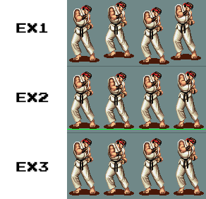
One method of keeping sheets organised is to make sure that all sprites within a designated animation remain on a straight line. This makes animating the sprites easier, as well as improving the visual appearance. See the example on the right:
EX1: Sprites are arranged next to each other, though aren't very neatly aligned.
EX2: Sprites are placed on a green line to help line up the bottom of the sprites.
EX3: The line is then removed, leaving us with a neat line of sprites.
Remember to leave sufficient space between sprites, and not have them overlap in any way. This can often be missed, where a sprite has an obscure shape and is overlapping the area of another sprite.
Please also keep sprites at a 1x pixel ratio. This means keeping the sprite at its original size. Reasons for the sprite coming out as blurry can be from an emulator window being resized, and not set to a console's native resolution. Most emulators will have a setting to reset the window's screen size to 1x the console's native resolution.
Get Everything
While this isn't strictly required, we do need sheets to be "as complete as possible". What we mean by this is, to put it simply, don't try to submit a Mario sheet and only include his idle animation. A sheet should at the least include the basic movements. You need to at least try and go for a more complete rip than knowingly decide to just submit 2 sprites from random actions.
Credit Tags
Credit tags are the box you see on most sheets that tell people who ripped the sheet, and any other information they wish to give. You can include one if you want.
Remember that people are looking at a sprite sheet to see the sprites, not be entertained or specifically read your tag.
A few things to consider with tags are:
Name: You can include your name if you want. It's not really required as we store your name in our database anyway, seen below a sheet.
Credit: Some people want to be credited when somebody uses the sheet, normally by writing "Give credit if used". Some people will also write "Credit not required". It's your choice whether you want to request credit or not, though we advise that you don't ask for it.
Additional Graphics: You can include a few little cosmetics to your tag if you like, though personally I think that simplicity goes down best. Don't be too distracting, and take up too much space.
Just remember that not including a tag is also a more than acceptable. It's quite likely that many people will simply ignore a tag, which is why the trend lately has been to simply not include one. This is of course your own personal preference.
File Format
The Spriters Resource accepts 2 files types: .PNG, and .GIF. While we accept .GIF, we advise that you simply use .PNG because of a color limitation to the .gif format.
To put it basically, the GIF file format can only contain 256 colors, whereas a PNG can have any number. PNG files also support "Alpha Transparency", which means that they can include anti-aliasing on the outside edge of a sprite, whereas GIF does not.
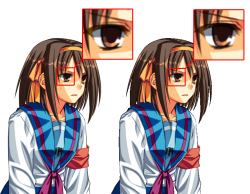
For a good comparison, click the image on the right. On the left of the image is a PNG, on the right is a GIF.
Notice the colors used in the eye. The GIF has had to give certain colors slightly alternative shades to try and compensate for its restricted palette, whereas the PNG is able to display all of these colors.
Another thing to note is the outline of the sprites. On the left, you can see that the PNG easily blends into a color, and looks smooth caused from its use of anti-aliasing. The GIF on the other hand has a very sharp and crisp outline, compensating the lighter shades for black, or removing them all together.
NEVER USE .JPEG or .JPG. For more information, please see the JPEG portion of our Dictionary.
The Sheet Icon
Icons for sprite sheets are 145px x 125px images. Unless the image fills up the entire icon, it should have a transparent background. The website itself creates the border and background for the icon.
Sheet icons must be in .PNG or .GIF format. The icon should give a quick idea of the content of the sheet, and not contain any sprites not present in the sheet.
Some sprites in the icon may be scaled up by 200% if they are too small for reasonable viewing. In this case NO SCALING FILTER should be applied, to preserve the sharpness and prevent making it blurry.
To see our old sheet icons, check out our History page.


